Wabi Sabi
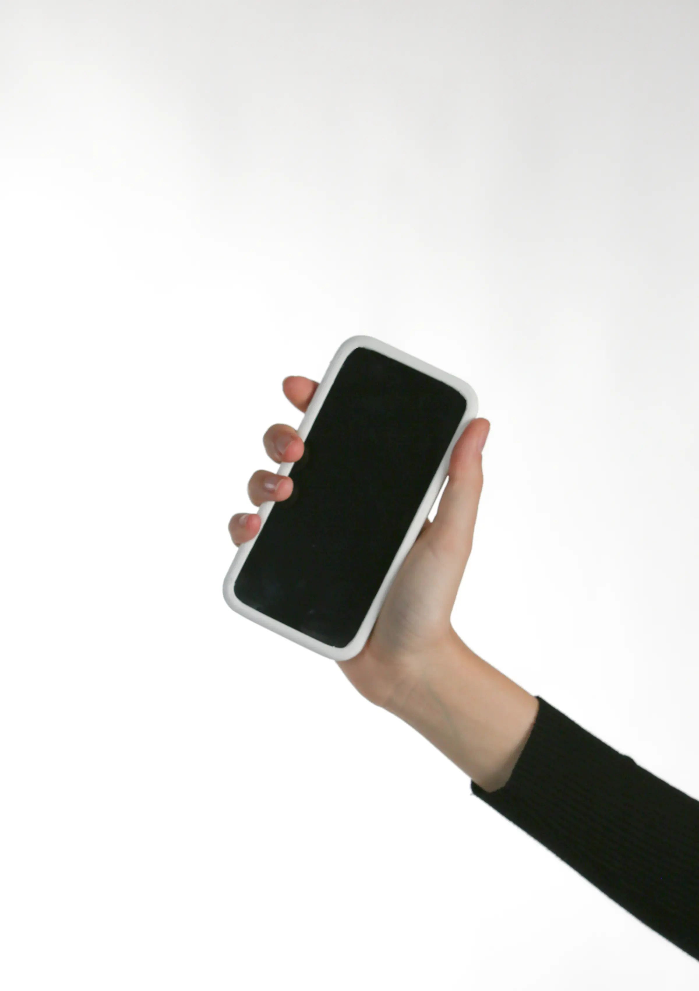
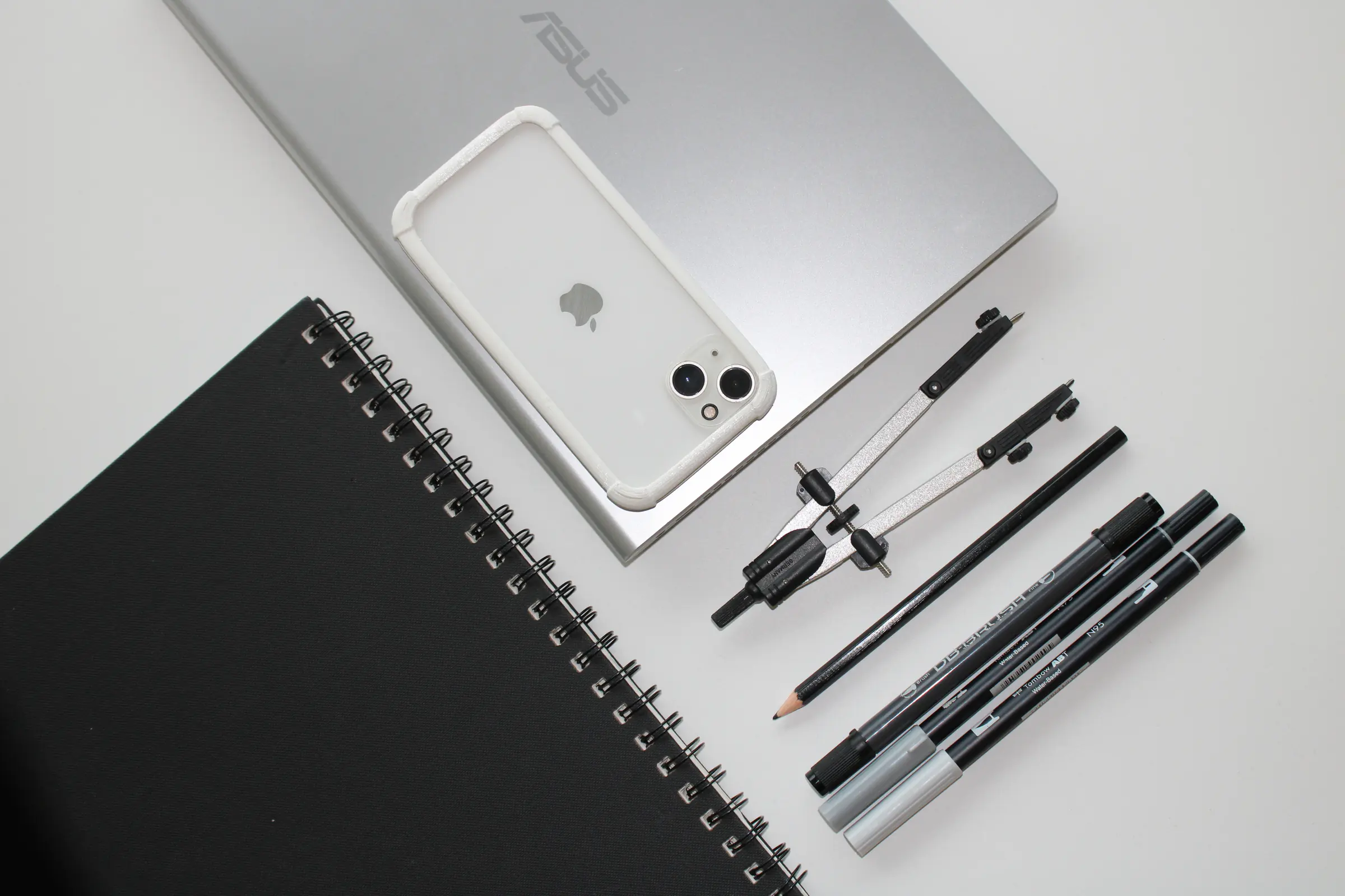
A universal iPhone case for MUJI - beauty in serenity, simplicity and imperfection.
- Brief
- design a product MUJI could sell
- Concept
- Wabi Sabi - beauty in serenity, simplicity and imperfection
- Range
- fits iPhone SE to iPhone 14
- Material
- flexible 3D-printing filament
Wabi Sabi was my first design project, from Design Skills - the introductory studio where I learned Rhino and the basics of the discipline. The brief was to design a product the Japanese brand MUJI could sell, addressing a problem related to technology. We named the project after the Japanese idea of finding beauty in serenity, simplicity and imperfection - a fitting frame for MUJI, and a discipline to design against.
Before designing anything, we worked out what MUJI actually stands for, and reduced it to three values we would have to honour. Simplicity: a post-war reaction against consumerism, no-brand, built on stripping away anything unnecessary. Universality: timeless, rational products that fit any person or place. And ethical awareness: minimal waste, reuse, and a deliberate stand against planned obsolescence - they do not make more than they can sell. Those three became the test every decision had to pass.
We started from phone addiction - the distraction, the lost concentration, the in-person time it quietly takes. "To disconnect with technology, to connect with yourself" became our line. Our first idea was a box with a locking system to stop you checking your phone, but it was bulky and only worked at home, so we dropped it. We wanted something you could carry everywhere, and after some rough prototyping we narrowed the goal to visual distraction. A phone case - an object people already carry and value - looked like the right vehicle, with a screen cover added.
Almost immediately a contradiction surfaced: a different case for every new phone is exactly the planned obsolescence MUJI exists to resist. The sheer variety of models drives an overcrowded, disposable market of phone accessories. So the project turned on a single, harder idea - one unobtrusive case that fits every phone. That made universality the brief, not a feature.
We ran a survey of 131 people to test our assumptions about screen use. Only ten percent kept to the one-to-two hours a day considered healthy; nearly half spent over five. The main drivers were visual stimuli and the anxiety of checking social media - and fifty-three percent thought they would use their phones less if they simply could not see the screen. Protection was the most valued feature; aesthetics and comfort came next, equally. Roughly half said they would buy a case that also covered the screen. To make one case fit everything, we broke down the 36 most common phone models, and from the largest and smallest dimensions concluded the case had to stretch at least four centimetres - while still clearing every camera, and with the edges excavated so buttons and ports stayed reachable.
We prototyped first in cardboard to get a feel for the form. Two early ideas fell away: four 3D-printed hard corners pulled together by a swimming cap (forming it to a precise shape was near impossible), and silicone (the obvious choice functionally, but it needs an industrial pressure mould we did not have). That pointed us to elastic 3D-printing filament, and to Filaflex 60A as the best of it.
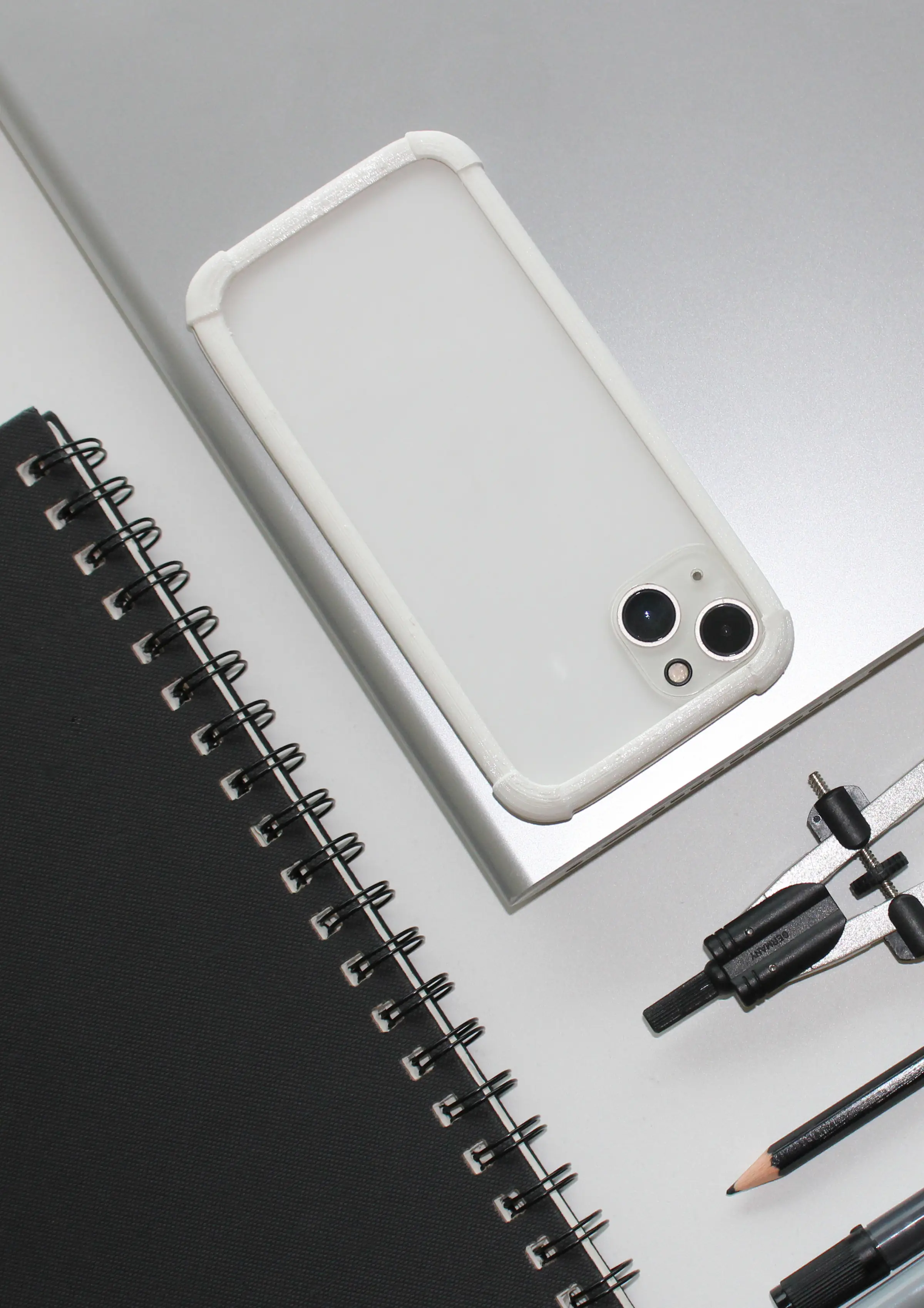
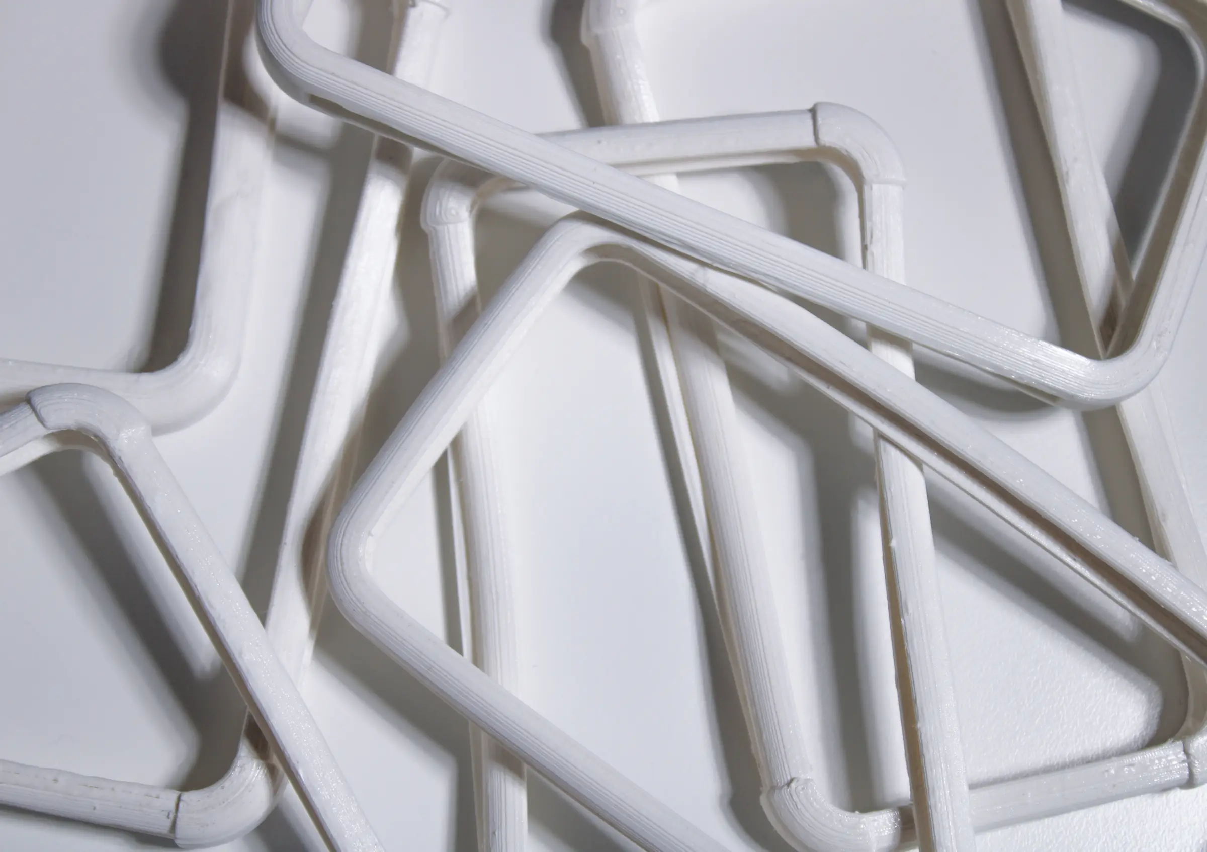
The case was found by taking things away. The first prototype gave the back a rhombus pattern borrowed from techniques that add flex to rigid materials like wood; it stretched over small and medium phones, but the pattern was not simple enough to sit right with MUJI. The second tried a solid back - simpler and more coherent, but the solid section killed the stretch and it only fit small phones. Dieter Rams gave us the way out: good design is as little design as possible. So we removed the back entirely and kept only the edges. That third prototype was more elastic than either, cleaner and more elegant - and it taught us that print temperature governs elasticity: tested in ten-degree steps, the coolest print at 210 degrees stretched furthest, fitting the largest phones we had. The fourth added a single millimetre over the front and back corners, so the case protects the screen and camera and bounces rather than cracks on impact, the elastic material muffling the hit.
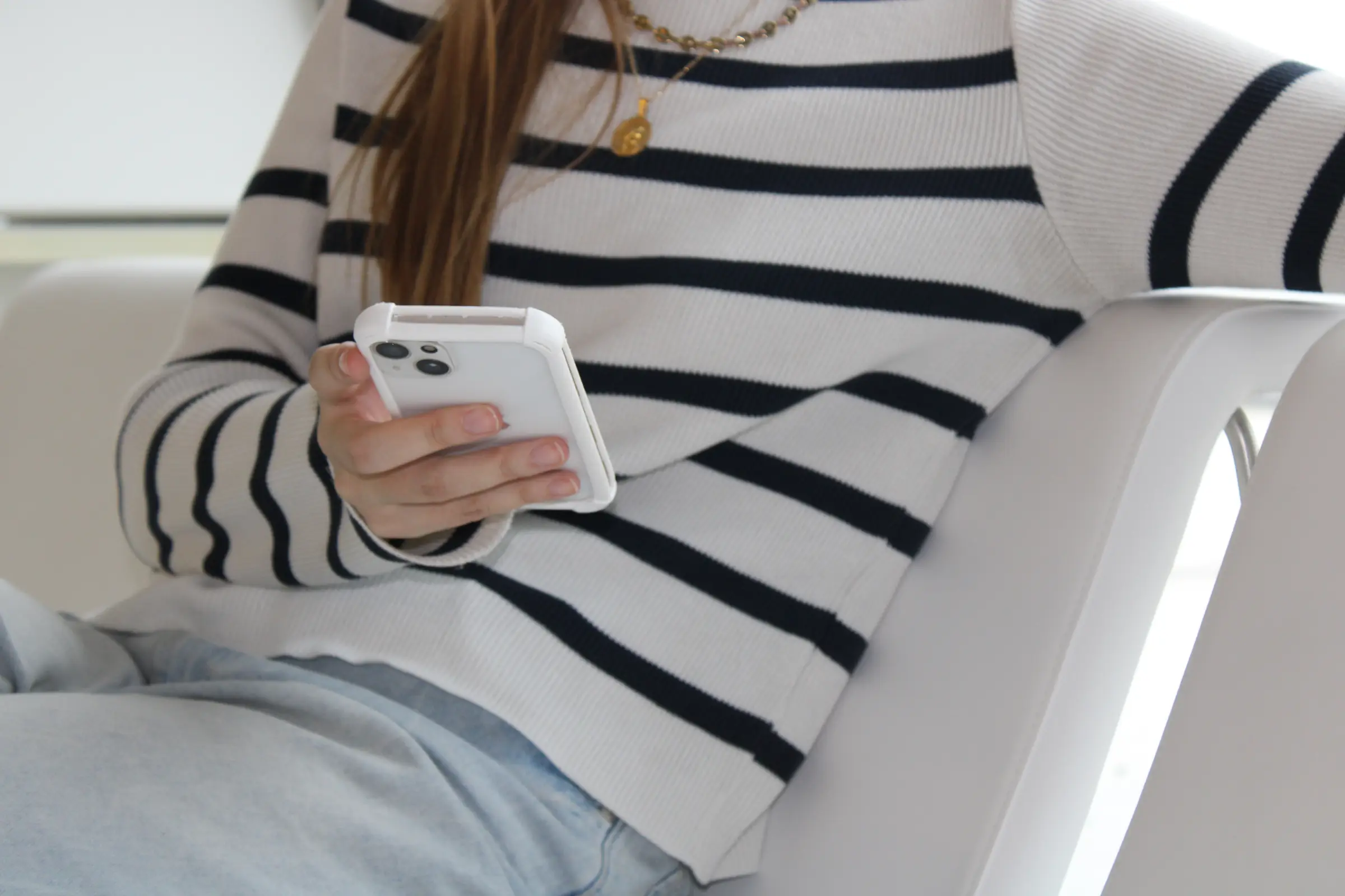
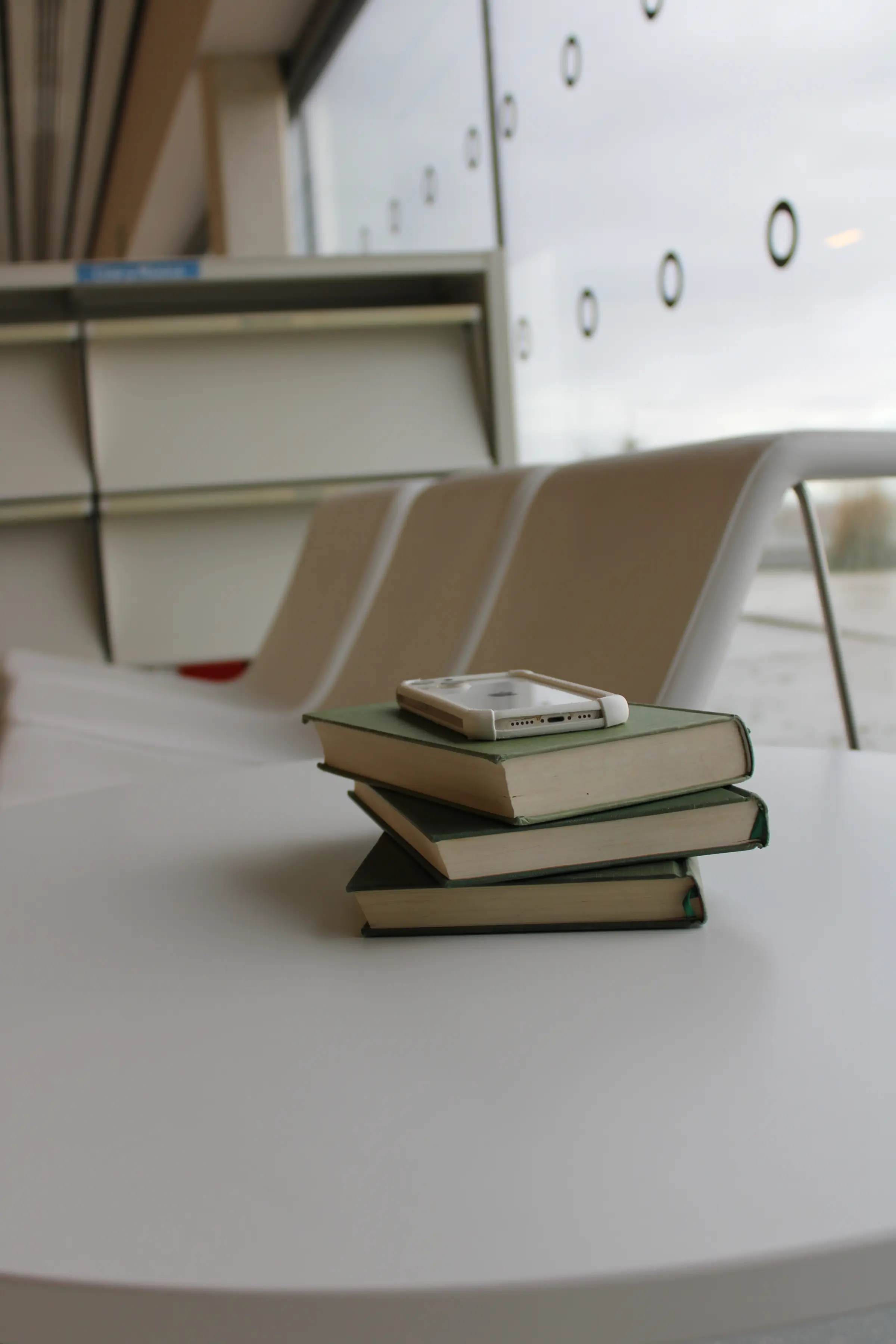

The screen cover stayed honest about its limits. To keep faith with the simplicity of the brief it had to be the same material as the case, a solid stretchable sheet. We printed it at one millimetre across three temperatures, and each failed differently: 210 degrees was elastic but too fragile, 220 was the cleanest print but not elastic enough for the bigger phones, and 230 sat in between but was still too brittle for daily use. The cover was the one piece we could not fully resolve in the material we had - and the project is better for saying so.
The final case does what the three values asked: lightweight, neutral and visually unobtrusive for simplicity; able to stretch in both directions without fouling cameras, notches or ports for universality, which was by far the hardest part; and reusable and long-lasting as a quiet stand against throwing a case away with every new phone. With a company like MUJI's access to silicone and compression moulding it could stretch further, cleaner and last longer; a magnetic universal front cover - along the lines of a tri-fold iPad case - would finally answer the visual-distraction goal; and the same idea of universal, long-lived protection could extend to tablets and laptops. As a first project, it also taught the team something the name had warned us about: a group of perfectionists learning to value imperfection, and to design by subtracting.