The Nuclear Question
An undergraduate thesis rebuilt as a public design intervention - making the case for, and against, a nuclear-powered Britain legible to anyone.
Visit the live site →- Type
- Bachelor in Design thesis - IE University, Madrid
- Role
- Research, data visualisation, design and build (solo)
- Built with
- Illustrator · D3 · Three.js / React Three Fiber · React + TypeScript · Cloudflare Pages
- Outputs
- Six-poster A1 series · live platform - thenuclearquestion.com
- Supervisor
- Professor Kaleb Cardenas Zavala
The most ambitious thing I've built, and the point where my design practice and my thesis research become a single project. The Nuclear Question is a six-poster data-visualisation series and a live public platform - thenuclearquestion.com - that takes one of the most contested questions in UK energy policy and makes it navigable for people who aren't engineers, lobbyists or activists.
It doesn't argue you into a position. It lays out the evidence - what the technology gets right and where the institutions around it fall short, in the same frame - and trusts you to reason through it yourself. The thesis behind it asks a deceptively simple question: how can design be used to discuss the feasibility of a nuclear-powered future? Not whether the technology works - it accepts that nuclear is mature, viable under the right conditions, and present in almost every credible UK net-zero pathway - but how we talk about it, and why decades of industry advocacy and environmental opposition have left the public conversation broken.
Hinkley Point C - Britain's newest reactor - has reportedly spent £700 million on fish-mitigation systems, saving an estimated 0.083 salmon and 0.028 sea trout per year.
Financial Times, 2025
That single number captures the state of the conversation. Britain built the world's first commercial nuclear reactor and is now the most expensive place on earth to build one. Meanwhile three-quarters of the UK's energy still comes from fossil fuels, no new reactor has switched on in 31 years, and every energy-security shock is a fresh reminder of what that dependence costs. The technology sits in nearly every serious decarbonisation plan - and the public who finances it has been spoken at, rarely with. That gap is a communication problem before it is a technical one, and communication is something design can actually act on.
The work is grounded in four ideas about how people actually form beliefs about risk. Paul Slovic shows that risk is felt before it is calculated - affect, dread and visibility govern perception far more than statistics, which is why the ‘information deficit model’, the assumption that more facts will change minds, keeps failing. Dan Kahan shows that identity filters evidence, so pure advocacy hardens the very opposition it means to persuade. Miranda Fricker shows that dismissing people's concerns as irrational compounds distrust rather than resolving it. And Michel Foucault's idea of parrhesia names the posture I took: truth-telling at a cost.
Together they point to a role for the designer that is neither advocate nor opponent - an epistemic facilitator, who creates the conditions for the public to reason well rather than telling them what to conclude.
A compressed history of nuclear communication - from the bomb, through Atoms for Peace, the accidents at Three Mile Island, Chernobyl and Fukushima, to today's climate reframing - surfaces four lessons the intervention is built not to repeat. The deficit model has failed for decades, yet the industry still leads with facts. Each crisis was met with withheld information and then over-reassurance, compounding mistrust. The visual conventions are inherited and emotional - the cooling tower (which emits only steam), the radiation trefoil, the peace symbol - shapes set in the 1940s still governing the response in 2026. And almost all of it has been partisan: Atoms for Peace was state propaganda, the protest posters were activism, even the prestige dramas are dramatised. That left a credibility gap neither side can close - and the space this project tries to occupy.
The argument rests on original research, not only a literature review. I ran two expert interviews - one with a senior investment professional who has spent decades managing nuclear-focused funds, one with a senior communications specialist who works on technically complex, politically sensitive industries - and a public-perception survey (n=59) testing how three framings, advocacy, opposition and ‘truth-teller’, were received across safety, waste and climate.
Do you know what twenty-dollar-per-megawatt-hour electricity feels like?
Practitioner A - nuclear-focused investor
Most PR is boring.
Practitioner B - communications specialist
The survey was directional rather than representative, but the pattern was consistent. 75% trusted the truth-teller framing on climate - the largest of the three margins - and 55% preferred sources that name both strengths and weaknesses. 65% wrongly believed nuclear waste stays dangerous for millions of years rather than thousands. And 0% trusted the nuclear industry itself as a source. The audience most open to this work prefers honesty over advocacy - and does not trust the people currently doing the advocating.
Read together, the research set the brief - five constraints, decided by the evidence rather than by me. One: lead with data the public is entitled to but rarely sees in a usable form. Two: name strengths and weaknesses in the same frame. Three: use a visual language that recognises an emotional response rather than flattening it. Four: declare my position openly - false neutrality is its own kind of propaganda. Five: publish the limitations alongside the conclusions, so the work stays examinable.
The remedy to our intellectual literacy is an emotional literacy - the ability to articulate feeling through means of expression. Without the balanced performance of intellect and feeling, man becomes crippled, one-sided.
László Moholy-Nagy
The intervention is six data-visualisation posters, built in the visual language of Federica Fragapane - organic forms, bespoke visual alphabets, proportion doing the emotional work that Slovic's research says has to come first. One question per poster. The first three ask whether nuclear is desirable on the metrics that matter; the last three ask whether Britain can actually do it. A reader is more likely to stop at a visualisation than to read a manifesto - and once they stop, they're open to learning.
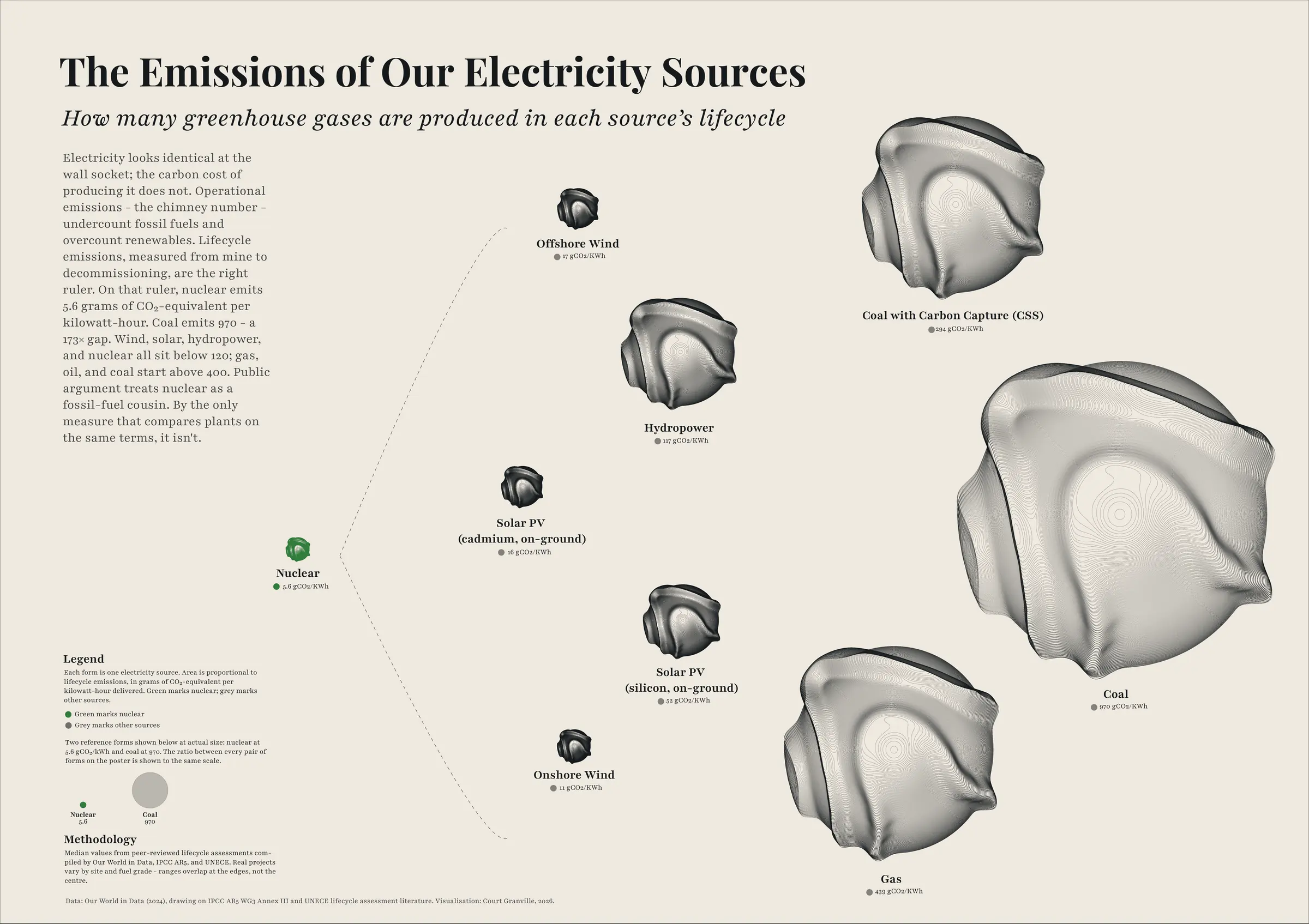
Nine ways of making electricity, drawn as organic forms scaled so their area is their lifecycle carbon - grams of CO₂ per kilowatt-hour, mine to decommissioning. Nuclear is the smallest form at 5.6g; coal is the largest at 970. The coal form occupies 173 times the area of the nuclear one, and the proportion makes the argument on its own. Using lifecycle rather than operational emissions matters: the operational figure flatters fossil fuels and penalises nuclear and renewables, whose footprint is mostly construction. Sources: IPCC AR5 and UNECE.
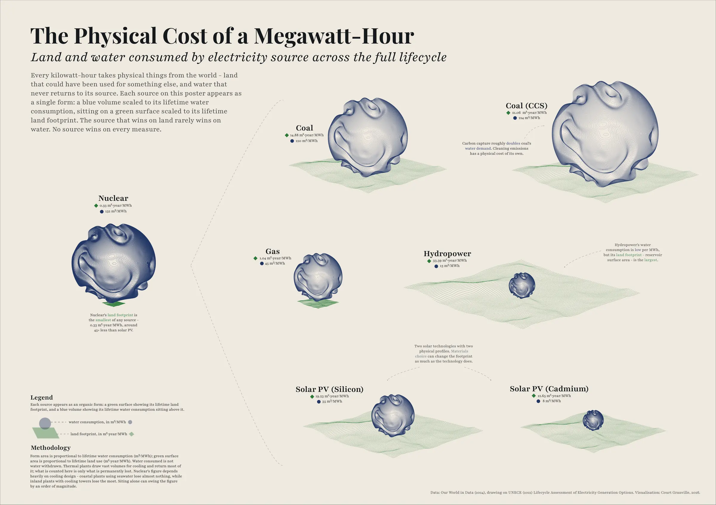
The same forms, now carrying land and water per megawatt-hour - because no source is free. Nuclear's land footprint is tiny but its water use is relatively high; hydropower barely sips water but floods enormous areas. Stacking the two metrics together is deliberate: it makes the point that the nuclear question, like any energy question, is never clean. To take part you have to be willing to compromise - and the honest work is deciding where the right compromises are.
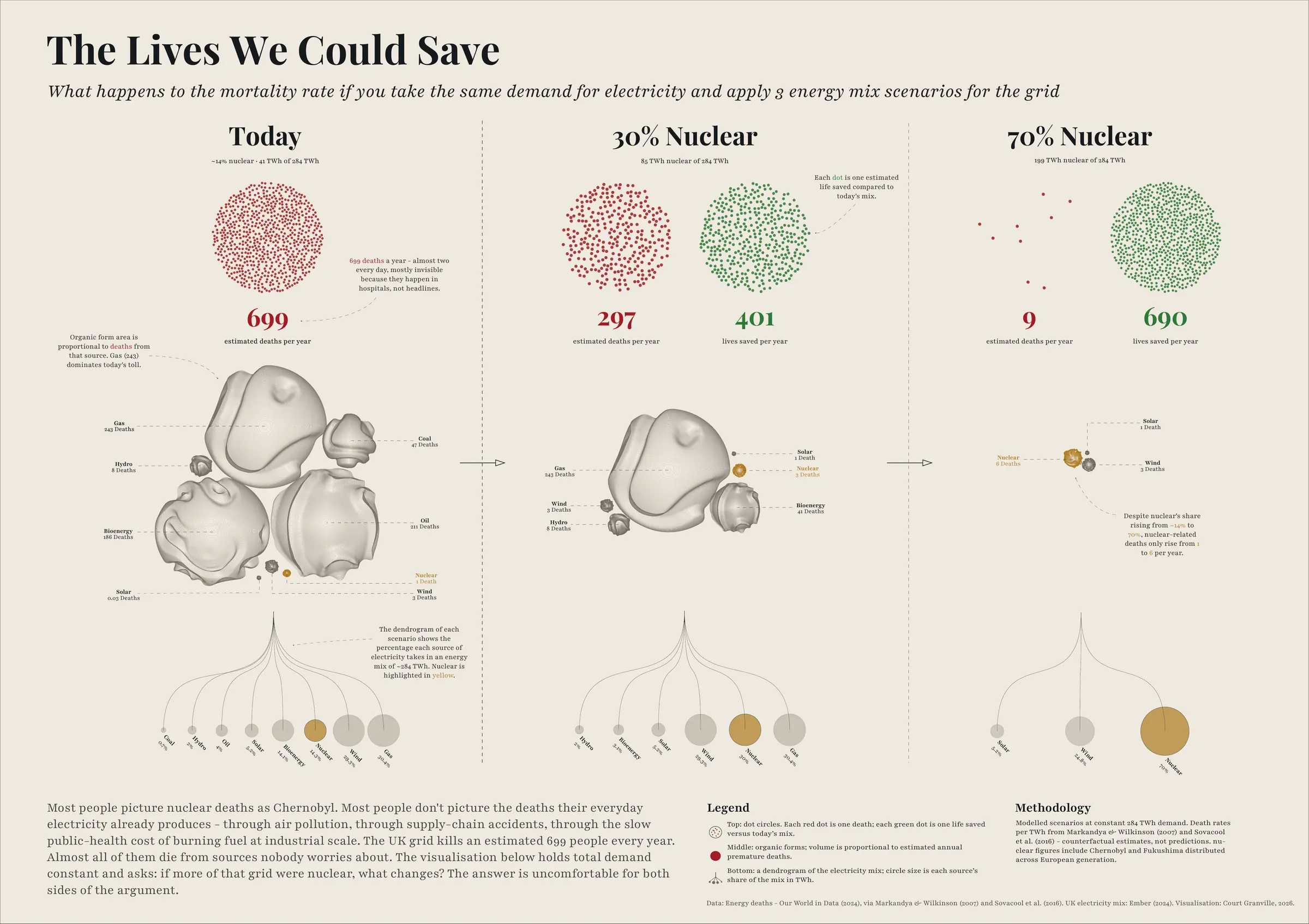
A piece of speculative design, after Dunne & Raby. It holds UK electricity demand constant and asks what changing the mix would do to the death toll - from air pollution, accidents and supply chains, the deaths today's electricity already causes but nobody pictures. Today's mix: 699 deaths a year. At 30% nuclear: 297, with 401 lives saved. At 70% - France's share - just 9, with 690 saved. Every dot is one estimated death, because a mortality rate is precise but unfeelable, and a person is not.
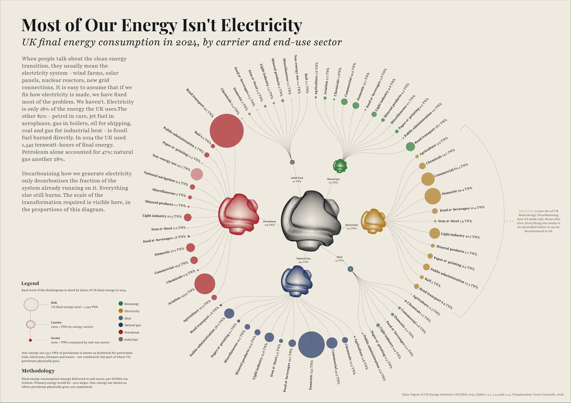
The poster that reframes everything before it. The nuclear-versus-renewables argument everyone has in mind is an argument about electricity - and electricity is only 18% of the UK's final energy. In 2024 the country used 1,542 TWh; petroleum accounted for 47% and gas for 28%, each dwarfing the entire electricity system. Decarbonising how we make electricity only decarbonises the fraction already running on it. A radial dendrogram maps the whole system at once, so the scale of what's left is impossible to miss.
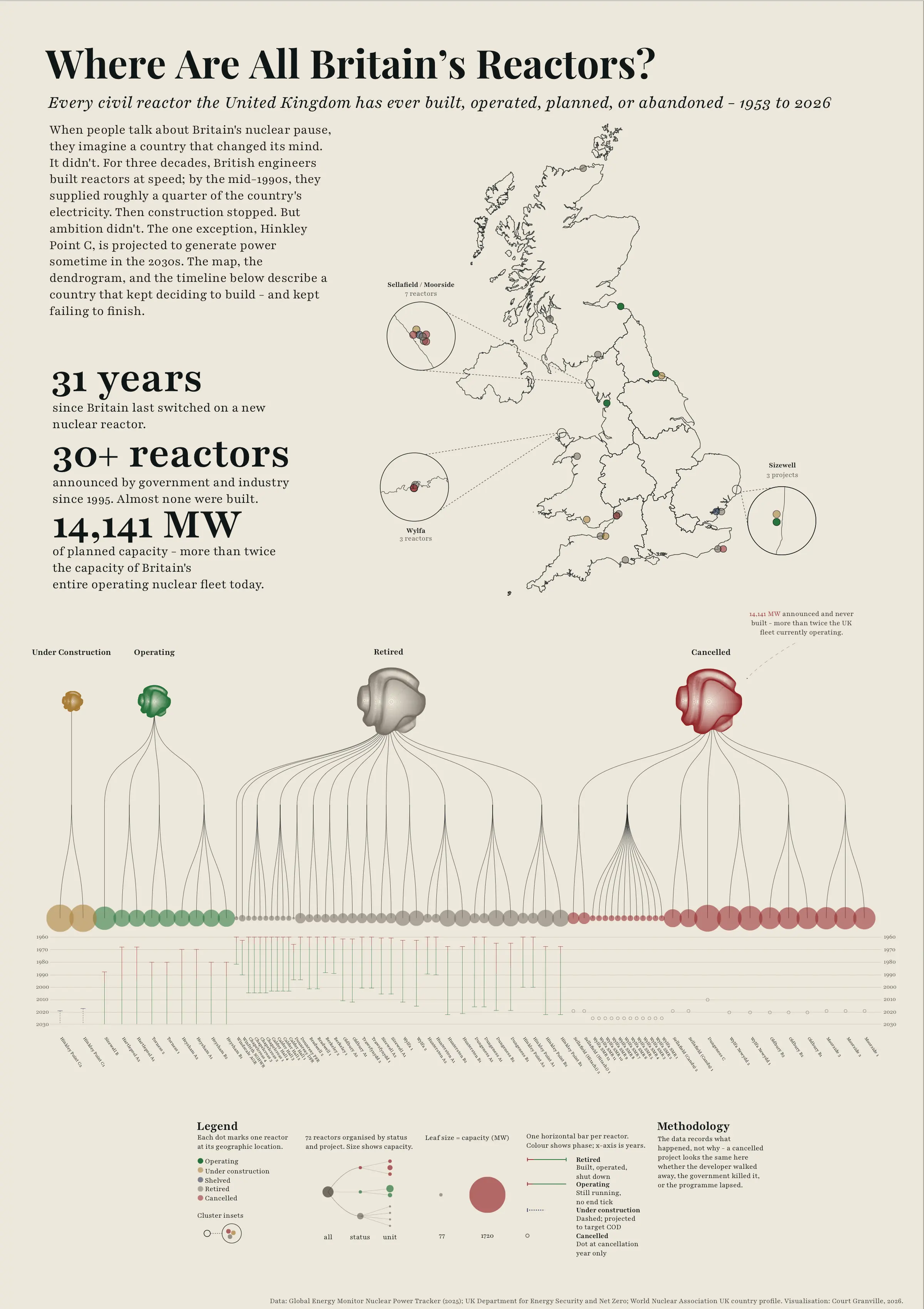
Every civil reactor Britain has built, operated, planned or abandoned, 1953 to 2026, mapped and sorted by fate. The pattern is stark: a country that built reactors at speed for three decades, then stopped. More than thirty announced since the mid-1990s; 14,141 MW of planned capacity that was never built - more than twice the operating fleet today; and 31 years since a new reactor last switched on. This is the most critical poster in the series, and the clearest proof that it isn't advocacy.
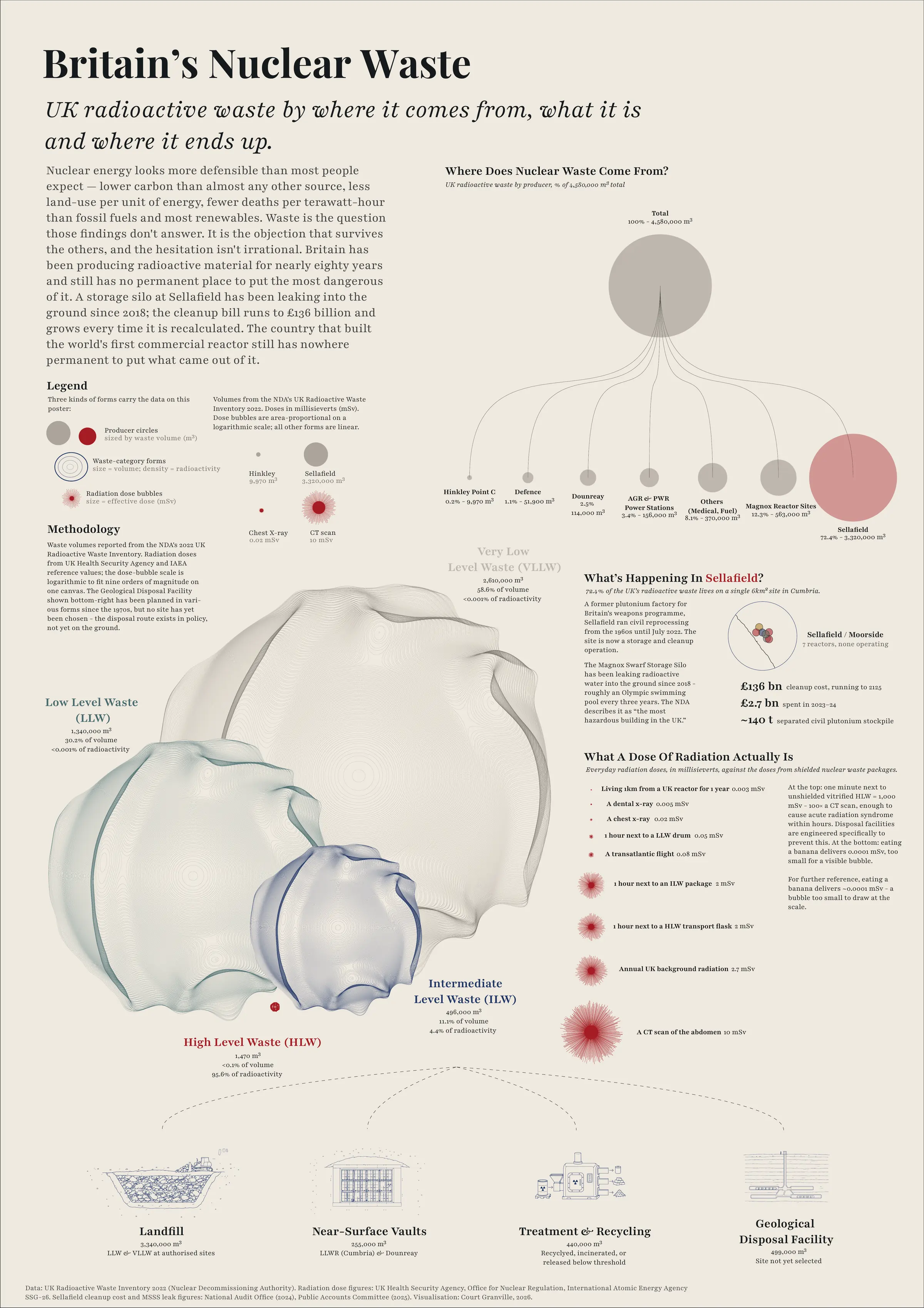
The hardest objection, met head-on rather than smoothed over - and my favourite poster in the series. Organic forms, scaled and colour-coded by waste category, show how little genuinely dangerous high-level waste the UK actually holds. Beside them, the poster is honest about Sellafield, where the overwhelming majority sits - legacy military and civilian waste, a roughly £136 billion clean-up bill, and real environmental and political problems the country has not solved. It is the most information-dense poster in the series, deliberately so: simplifying the waste question is exactly what the audience distrusts.
This is the poster rendered as the 3D object at the top of the page. Every poster is published with its full dataset on the site, and all six are free to download as full-resolution A1 prints: 001 · 002 · 003 · 004 · 005 · 006.
The series argues; the website is where the argument meets an audience at scale. It began as a workaround - the thesis portal wouldn't take high-resolution files - and became the more interesting half of the project. Each poster is rebuilt as its own interactive, animated page: the organic forms come alive, the data responds to the cursor, and the same proportions and figures carry across from print. There is an easter egg on the homepage - select the Uranium-238 isotope on the atom, and you can split it.
I built it over about two weeks and a hundred and fifty deployments, directing rather than hand-coding: Manus for the first working draft, then Claude Code to build every interactive piece, on a stack of React and TypeScript, Three.js and React Three Fiber for the 3D, and D3 for the charts, published on Cloudflare Pages and version-controlled on GitHub. The point isn't the tools - it's that work which would once have needed a small studio and several months can now be delivered by one designer in weeks. The bottleneck has moved from production to editorial judgement, which is where design has always lived. The discipline stays design; the technical literacy just has to be real.
The risk in work like this is obvious: where does honest facilitation end and clever persuasion begin? I built in three safeguards. I state my position - that nuclear is likely necessary for Britain's decarbonisation - in the introduction and the conclusion, so every reader weighs the work against a known view rather than an implied one. I publish the negatives: Poster 005 names the 31 years; Poster 006 names the £136 billion. If this were advocacy, those posters wouldn't exist - they cost the position something on every page. And I make the work examinable: every dataset is on the site, every limitation declared. The audit trail is the discipline that keeps it honest - to me, before anyone else.
In the spirit of the work itself: the survey is 59 people, skewed young, university-educated and international, and it doesn't capture those strongly opposed to nuclear, or those most affected by it - so I treat it as directional, not representative. With more time I'd widen the series to safety and economics, and test it well beyond my own networks. The platform is honest about all of this, because a project that argues for examinability has to be examinable first.